Crafting powerful ocean science data stories: A spotlight interview with Yun Sun
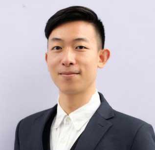
Yun Sun joined the United Nations Educational, Scientific, and Cultural Organization (UNESCO) in 2020 as a Junior Professional Officer and is currently working in the ocean science section of the Intergovernmental Oceanographic Commission. Her main job responsibility is to deliver a programme called “Harmful Algal Bloom” (HAB). When microalgae grow out of control, it can create very harmful effects like massive fish kill and the contamination of safe food, altering ecosystems in ways that people perceive as harmful. The programme that Yun works on aims to help Member States build the capacity to understand, manage, and mitigate such harmful effects.
In this spotlight interview Yun shares her learning journey with Itziar Arispe, Evaluation Learning Specialist, at UNSSC.
Itziar: Why was it important for you to pursue the UN Data Analytics professional certificate?
Yun: I think there were two main reasons. My primary motivation was my interest in working with data. I majored in geographic information systems and remote sensing. So, I deal with special data for information extraction and spatial analysis. I'm always amazed by how much insight we can derive from data through data analytics. And this special data is quite unique . It has its own processing tools and techniques. So based on this, I wanted to learn more about data analytics.
The second reason is, in my daily work, we have a global database that contains records from all over the world about algae events. I really want to empower myself with the ability to better manage the data and better deliver my work.
There are many other learning materials online, but I found UNSSC’s course very systematic. It gives a general overview of different parts of data analytics. And also, most importantly, it's focused on the UN context because we all work for the UN. We really want to see how the other organizations deal with data. We really want to learn from the experience of others.
Itziar: What are some of the most memorable parts of this learning experience?
Yun: I think the whole learning experience was wonderful and filled with many good moments. I really liked all the instructors because they have experience and expertise, not only in their fields but also in the way of their teaching. For each webinar, it's such a difficult task to explain within two hours, but they make it very interactive, comprehensible and engaging. Online webinars have their own limitations. People can get tired very easily and lose focus. But I felt during the whole process, I could concentrate. I felt the same spirit from other participants. Everyone was very engaged.
My favourite part of the course is the breakout sessionIt provided us with an opportunity to work with colleagues from different UN organizations, and we worked on the same topic and contributed our experience from our own organization’s point of view. It's such a rare opportunity. It builds a community of practice for us. Because in daily work, it might be awkward for me to approach colleagues from other UN agencies with so different expertise.
Itziar: In terms of ‘on-the-job practice’, Could you please share what practical experience you gained?
Yun: I selected data visualization and storytelling because it's a hot topic and I know that practice makes perfect. The case study I chose was about unpaid domestic care work around the world. When the instructor showed us tools like Flourish, Tableau, and Power BI, it all looked really easy. But when I actually worked on it, I met a lot of challenges.
It's not only the parameter setting of the software, but also how you choose the most suitable graph or chart to present your data in an effective way. Fortunately, the instructor provided me with tailored learning materials that helped me approach the exercise step by step and use more of my own thinking.
I really learned a lot about how to make graphs and charts. The number one principle is to put the reader first. Second, is to make the legend very clear. You don't want readers to spend time looking for where it is, what the chart stands for, or what a particular colour stands for. Thirdly, avoid information overload while highlighting the key information. Use some techniques to highlight the information that you want to stress the most. Lastly, be considerate of those readers who might have disabilities. Some people might be colour-blind, so don't rely solely on colour. You can also put text below the charts to help explain. These are called accessible graphs. In the future, I will continually remind myself to design graphs and charts that are accessible.
Itziar: How do you intend to utilize the skills you gained from this course in your work?
Yun: Besides making powerful visualizations and data stories, what I want to explore is predictive analytics to use machine learning platforms. The Intergovernmental Oceanographic Commission of UNESCO has a global database that contains a very good dataset on algae events. It can be a very good training dataset. I really want to see how predictive analytics can help us provide more insight. For our programme, one of the focuses is to predict the occurrence of harmful algae events. So these techniques match perfectly with our needs.

